Package Design
Q Mixers
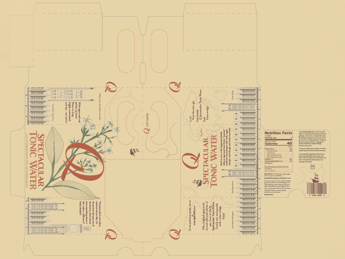
In the process of revitalizing Q, a premier mixer brand, a deliberate shift in its visual identity is envisioned, transitioning from a contemporary and sophisticated style to one that exudes classical elegance and timelessness. This strategic evolution is driven by the objective of maintaining brand recognition while expanding its appeal to a broader and more discerning audience. The overarching goal is to evoke a sense of tradition and heritage, infusing the brand with a timeless quality that resonates with consumers seeking sophistication and refinement. Through this transformation, Q seeks to uphold its reputation for delivering high-quality mixers while simultaneously positioning itself as a purveyor of timeless indulgence and luxury in the world of beverages.

Infusing a classical drawing style inspired by etching techniques into the design overhaul for Q Mixers would introduce an elegant and enduring aspect to the brand’s visual identity. Etching is renowned for its intricate lines, meticulous shading, and cross-hatching, often portraying scenes, motifs, or patterns with exquisite detail. Under this design approach, the packaging and branding materials could showcase etched illustrations of timeless map patterns and vintage botanicals. By employing fine lines and meticulous detailing, the brand would convey a sense of craftsmanship, tradition, and sophistication, aligning perfectly with its classical style transformation.
In the process of refining the logo for Q, meticulous attention was devoted to rebuilding it using only Bézier curves, with a focus on minimizing the number of nodes employed. This approach was instrumental in preserving the clarity and precision of the logo’s design, ensuring that each curve and line maintained its integrity and crispness. By strategically simplifying the logo’s structure, unnecessary complexity was eliminated, resulting in a sleek and streamlined aesthetic. The careful manipulation of Bézier curves allowed for precise control over the logo’s form, enabling subtle adjustments to be made while maintaining overall coherence. This commitment to precision not only enhances the logo’s visual impact but also reinforces Q’s commitment to excellence and attention to detail.
